Nimber
Nimber was the first company I started working for as a product designer, therefore it is near and dear to me. In short, Nimber is to deliveries what Airbnb is to rooms. The idea is simple; if you need to send something somewhere — say some keys, a few books, a bike, furniture, you name it — through Nimber you can find a person heading that way and let them deliver your item for you. And it also works in reverse! If you’re travelling somewhere and want to make some extra cash, through Nimber you can find people that need to send something wherever you’re going, and deliver it for them.
I joined Nimber at a crucial point in their journey. After successfully releasing their website and iOS app, they were planning to expand their service to Android as well. More importantly, it was time for the service to grow into a monetised platform. My role as a product designer was to work with the product lead, the design lead, and the engineering team to make Nimber into a usable product that genuinely helped to make people’s lives easier.
Designing the Android app
The first couple of months of my involvement were heavily focused on designing the Android experience. I spent some time getting to know the product with all its details and intricacies, including visual identity, tone of voice, feature-set, technical background, limitations and more. Having the iOS app as a base, I started ‘translating’ it into an Android experience, maintaining its core functionality and identity, while adapting it to Android’s platform specifications and Material Design language. I worked closely and frequently with the Android engineer to create the app, and often joined them in coding the user interface. The app made it to the Play Store in a few months time.

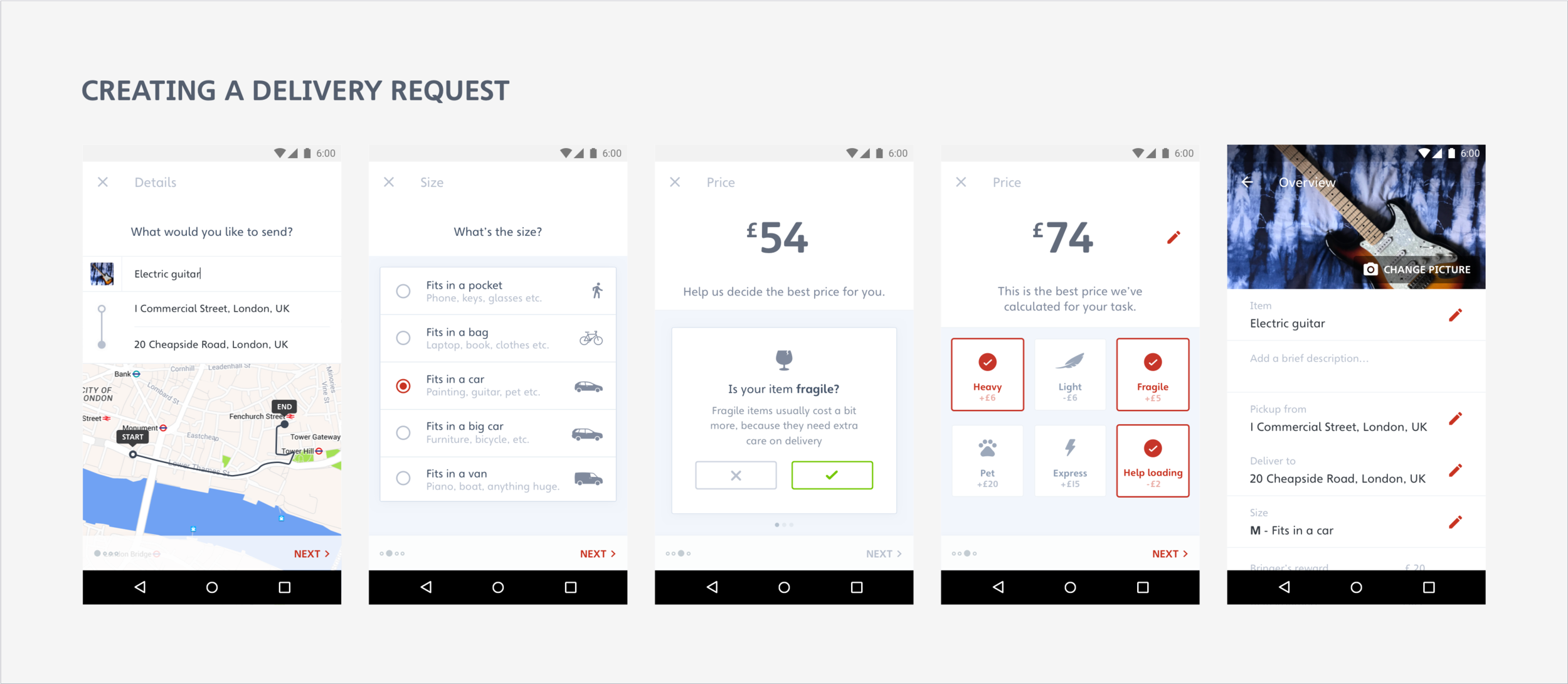
Expanding to all platforms
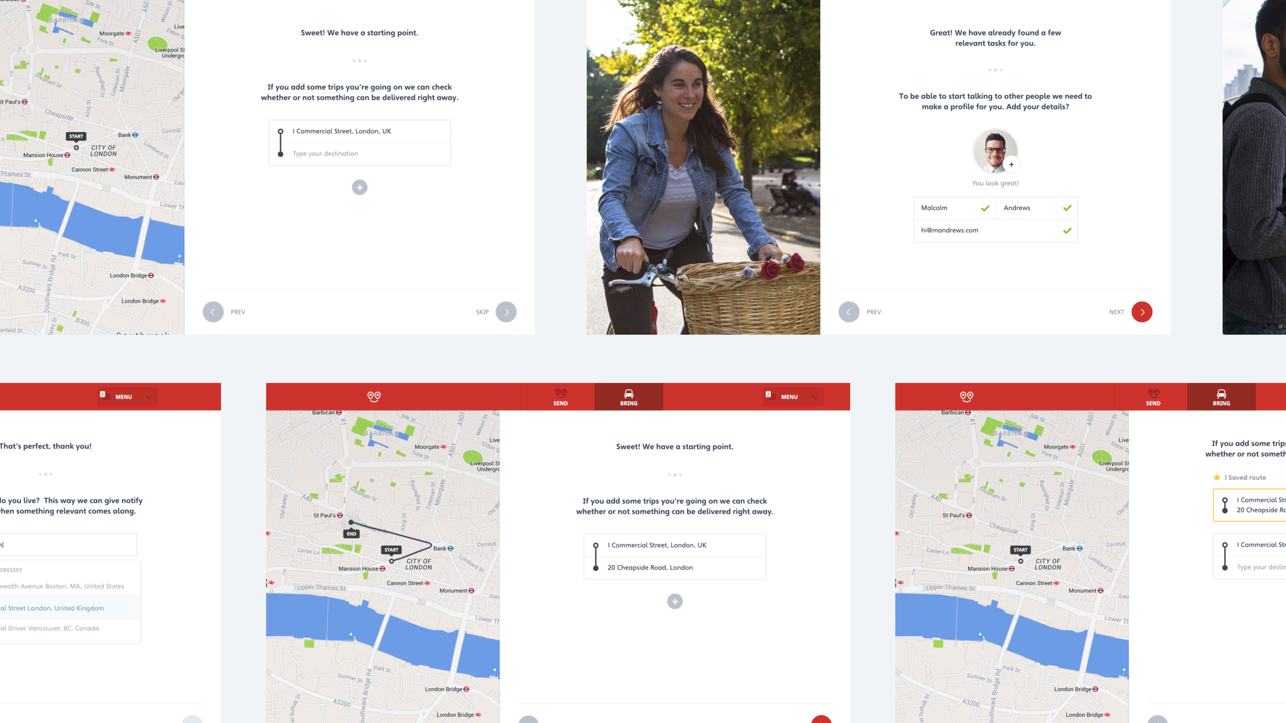
After this major milestone in Nimber’s journey, I got more involved in developing and designing ideas for all three platforms; Android, iOS, and even web. This was a period of growth, and we spent a lot of time brainstorming, doing short design sprints, and even a hackathon to generate potential solutions for our customers.
We employed a very lean method of designing the product. We used analytics from all platforms to get a clear sense of who our users were and how they behaved while using the product. Our efforts were focused on identifying pain points of the product and brainstorming hypotheses that would help resolve these problems. For each of these ideas, I would start with simple pen and paper wireframing (which I’ve saved none of, hence the lack of sketches in this case study). It made it easier to share thoughts with the rest of the team and get feedback before proceeding to a more solid part of the design process, where changes may be more costly.


User testing and visual design
I am super fortunate to have been given the ability to include user testing in the design process. After wireframing reached a desirable quality, the next step for me was always to design a basic version of the user interface, exposing only the core functionality of a potential new feature, and thoroughly user-test it to gain feedback from real users. I created clickable prototypes on InVision, and used usertesting.com to send out the prototypes into the hands of people.
The user testing phase always proves to be the most insightful phase of the design process. For every iteration of a feature, I used to send out the prototype to multiple people at a time, and watch how they used the product while they expressed their thoughts out loud. I gathered their feedback and used it to improve the designs I had previously made. For every new iteration, I sent out new prototypes until the feature reached a desirable level of quality.
From then on, it was time to go deep into visual design, and give the successfully tested feature the look it deserves. In most cases, I continued making prototypes with more advanced prototyping tools, such as Flinto, to define detailed interactions and transitions within the user journey. This proved to be helpful to developers a lot, as they had a clearer spec for what to build, but also for me to showcase upcoming features to the stakeholders of the company.
Beyond product design
During my involvement with Nimber, not only did I get to design a wide range of features for all of the product’s platforms, but I also got to create some engaging graphics for Nimber’s social media accounts, promotional videos, ads, and — one of my favourites — a dashboard TvOS app for our office. Since this wasn’t a user-facing project, I had complete liberty to explore different visual styles and go crazy animating it with After Effects. It ended up looking like something out of Minority Report, but it was a really fun and entertaining exercise.

Conclusion
At the end of my involvement, Nimber had matured significantly in user experience and product quality. Unfortunately, due to company limitations the Android app isn’t available on the Play Store anymore. But working with Nimber was one of the most significant steps in my journey as a product designer. I acquired indispensable experience of working within a team, learned about user behaviour, brought designs to life with prototyping and animation, gained insight from user testing and used it to further improve the product. I learned what design thinking means and my skills as a product designer benefited a great deal from my journey with Nimber.